inchworms -
Wed 14 August, 2013, 16:00
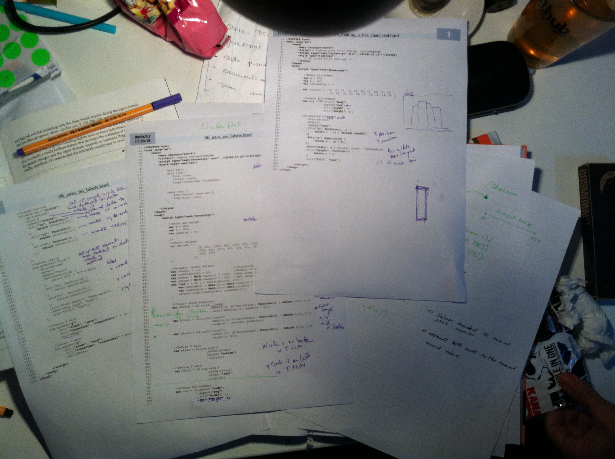
We started with going through all the code we already worked with to check whether or not we understood. Luckily we had some printer paper, so printed some files out to annotate by hand. This is how it looked:

We were kind of able to explain all the cryptic looking code, yeay!
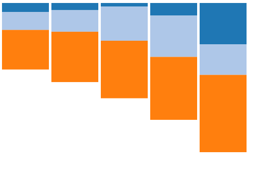
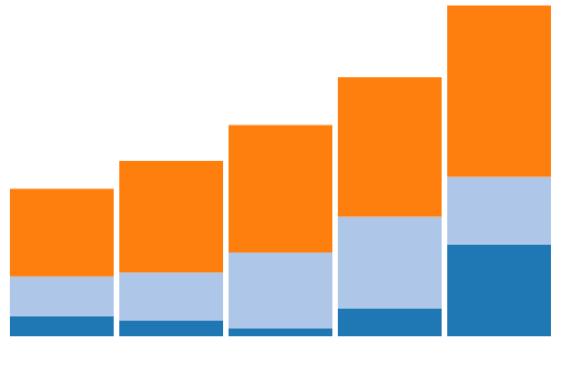
Relieved we confronted our next challenge: turning a stack upside down.

After
… hours of pondering.

The result was overwelming and worth it :)

inchworms -
Tue 13 August, 2013, 17:00
Today, after finishing the chapter on interactivity, we started playing with D3 layouts.
The first layout explained was a Pie. We thought it would be fun to make a pie that represented what we spent most of the day doing. One for each of us.
Creating the pie was pretty straightforward. But working out how to make each piece of the pie respond to mouseover/mousemove/mouseout, so that the name of each pie-piece appeared as a graphic overlay, proved to be a GRAND HEADACHE!
Carla found a lame-ish solution that added each pie-piece name to a ‘title’ element. Modern browsers would automatically show this upon mouse rollover. You can see it below, although you might need to roll your mouse over and then wait a moment.
Carla was quite happy with this but Anja was unimpressed. Partly because it was a solution that she had not found, but also because the name’s appearance just took too long to appear.
So she found this solution:
–>We need to send a big shout out to @mortice for helping us work out how to get our javascript working on our jekyll blog. Don’t tell anyone but he is a secret front end developer too…

inchworms -
Mon 12 August, 2013, 17:14
Today after Anja went nuts and Carla found the right music, we created a little video showing the beauty of data visualisation.
Then we did some more serious stuff with d3, like adding a mask, randomizing data, updating scales and axes. It was really heavy and Carla kept complaining about her Narcolepsy.
Afterwards we needed a “Luftzigarettenpause”. Phew. I think Carla is already addicted.

inchworms -
Fri 9 August, 2013, 16:00
Today we went on with the Data Vizualisation book and read about scaling data values. As Mike Bostock says: Scales are functions that map from an input domain to an output range.
We used the learning-by-repetition style to drum the key D3 domain-range concept into our heads:
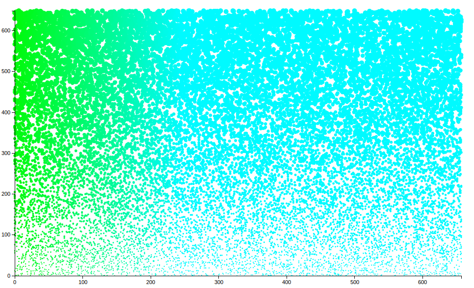
The next step in visualisation style were scatter plots. Once again, Anja took a simple scatter plot and fed it steroids:

All we need now is useful data. Give us data! We want to make a scatter plot with meaning, and not just pretty colours:)…
Wishing you all a happy weekend!

inchworms -
Thu 8 August, 2013, 16:26
Today was spent reading our D3 primer Interactive Data Vizualisation for the Web. We really like this book, and are finding it an incredibly useful introduction to the javascript framework we’ll most likely be using on our farmsubsidy.org project.
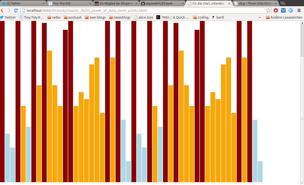
We worked through Chapter 5 and Chapter 6, progressing from generating page elements, to binding data, to drawing divs, to drawing svgs. Anja was, naturlich, very excited at the prospect of playing with different colours. She took the (rather bland) teal of the book’s examples:

And turned it into a ‘DarkRed’, ‘LightBlue’, ‘Orange’ delight:

(For a list of CSS colour names we referred to the W3C website)
She also made the whole chart taller because she wanted it to fill her entire screen.
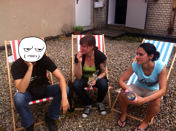
Then @bioshrimp came to visit for lunch. We sat on the roof and tried to look cool. Only @bioshrimp succeeded - no one with tats so good could ever look uncool :-)
(Anja will post a photo here later, once she has redacted her face from the shot...)
Done!
