Scatter Plots
Today we went on with the Data Vizualisation book and read about scaling data values. As Mike Bostock says: Scales are functions that map from an input domain to an output range.
We used the learning-by-repetition style to drum the key D3 domain-range concept into our heads:
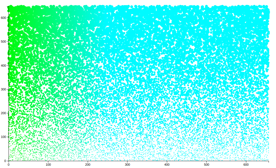
The next step in visualisation style were scatter plots. Once again, Anja took a simple scatter plot and fed it steroids:

All we need now is useful data. Give us data! We want to make a scatter plot with meaning, and not just pretty colours:)…
Wishing you all a happy weekend!

